Designing Beyond Default: SailPoint Form UI Customization

Tyler
IdentityEXE Founder
Form Adoption vs. Form Function
As Identity Access Management (IAM) professionals, we spend weeks designing robust joiner-mover-leaver processes, automated workflows, and complex approvals. When it's time to roll them out to the business, we deploy them using out-of-the-box, plain-text forms. We tell ourselves that as long as the form is functional and the backend APIs provision access correctly, our job is done.
But then the complaints roll in. Business managers find the forms confusing. End users request access for the wrong systems because the forms don't provide clear context. The business doesn't want to use our carefully crafted IAM portal—they tolerate it.
What if you could design forms that users actually enjoy using? Forms that carry your organization’s branding, feature rich dashboard-style summaries, collapse technical logs behind interactive dropdowns, and dynamically format complex multi-system details?
This blog post fixes the form adoption gap. We will walk you through the undocumented and underutilized capabilities of the SailPoint Identity Security Cloud (ISC) Forms engine—starting from basic HTML elements and progressing all the way to advanced layouts, custom Unicode title formatting, and dynamic variable compilation via serial workflow loops.
Form Body-Based Customization: The Basics
When designing forms within SailPoint ISC, the section descriptions, field descriptions, and injected workflow variables are not restricted to plain text. The Form UI rendering engine features a robust Document Object Model (DOM) pipeline that parses standard HTML tags and basic inline CSS.
To see what you can edit out-of-the-box in the standard Forms designer interface:

If you need to structure a standard request block or highlight a policy warning, you can use these core HTML elements natively in your form body configurations:
1. Typography & Structure Tags
<div>(Block Container): Isolates custom styled text blocks.<div style='background-color: gray; padding: 10px;'>This is text inside an isolated div block.</div><span>(Inline Wrapper): Applies inline styles to specific words without breaking the line flow.Text before the span <span style='color: blue;'>this text is inside an isolated span</span> text after.<p>(Paragraph): Groups text sentences with default spacing.<p>This is paragraph number one.</p><p>This is paragraph number two.</p><br>(Line Break): Inserts a line break to split strings vertically.Line number one text.<br>Line number two text right below it.<hr>(Horizontal Rule): Draws a clean divider line to separate sections.Text above the line. <hr> Text below the line.
2. Text Formatting & Semantics
You can call out important variables, system names, or policy warnings using standard inline semantic elements:
<strong>or<b>(Bold): Emphasizes critical words.This is standard text and <strong>this text should be strictly bolded</strong>.<em>or<i>(Italics): Denotes emphasis or subtext.This is standard text and <em>this text is italicized via emphasis</em>.<code>(Inline Code Block): Formats account identifiers, APIs, or configuration parameters in monospace text.The target account identifier is <code>xyz_employee_123</code>.<pre>(Preformatted Text): Preserves text formatting, including spaces and indentation, directly in the UI.<pre> Line 1: Preserving spaces Line 2: and indentation Line 3: exactly like this. </pre>
Intermediate Layouts, Spacing & Tables
Forms often need to present lists of entitlements or tabular summaries of requested roles. Instead of relying on long, hard-to-read paragraphs, you can structure your forms using tables, bulleted lists, and inline CSS box alignment properties.
1. List Tags
<ul>&<li>(Unordered List): Creates standard bulleted lists for summarizing requirements or roles.<ul> <li>First unordered item</li> <li>Second unordered item</li> </ul><ol>&<li>(Ordered List): Creates numbered lists to guide users through multi-step instructions.<ol> <li>First numbered item</li> <li>Second numbered item</li> </ol>
2. Tabular Data Tags
To present clean attribute maps, use the standard <table> structure:
<table style='width: 100%; border-collapse: collapse;'>
  <tr style='background-color: #1a1a1a; color: white;'>
    <th style='padding: 6px; width: 30%; text-align: left;'>Permission</th>
    <th style='padding: 6px; width: 70%; text-align: left;'>Risk Level</th>
  </tr>
  <tr style='border-bottom: 1px solid #eee;'>
    <td style='padding: 6px;'>Domain Admin</td>
    <td style='padding: 6px; color: red; font-weight: bold;'>CRITICAL</td>
  </tr>
</table>
3. Inline CSS Layout Properties
Modern layouts are built on Flexbox and CSS Grid. You can use these inline properties in your containers to structure elements side-by-side:
display: flex;: aligns elements horizontally or vertically.<div style='display: flex;'><div style='padding: 5px;'>Left Item</div><div style='padding: 5px;'>Right Item</div></div>display: grid;: creates complex multi-column grids.<div style='display: grid; grid-template-columns: auto auto;'><div style='padding: 5px;'>Cell 1</div><div style='padding: 5px;'>Cell 2</div></div>justify-content: space-between;: pushes items to opposite sides.<div style='display: flex; justify-content: space-between;'><span>Left Aligned</span><span>Right Aligned</span></div>align-items: center;: centers items vertically.<div style='display: flex; align-items: center; height: 50px;'><span>Vertically Centered Text</span></div>
4. CSS Box Model & Spacing
Control the spacing and width of your custom widgets using properties like padding, margin-bottom, width, and max-width to prevent form fields from shifting:
<div style='padding: 25px; margin-bottom: 30px; max-width: 500px; background-color: lightgray;'>
  Testing spacing, margins, and constrained max-width.
</div>
Advanced CSS, Visual Polish & Interactive Elements
If you want to take your forms from basic HTML layouts to premium, enterprise-grade dashboards, you can leverage advanced CSS techniques like border accents, box shadows, text rendering overrides, and native interactive components.
1. Borders, Backgrounds & Shadows
border-left(Left Accent Border): Perfect for making warnings or notices stand out.border-radius: Creates soft, modern curved borders.box-shadow: Adds visual depth and lift.
<div style='box-shadow: 0 4px 6px rgba(0,0,0,0.1); border: 1px solid #ddd; border-left: 5px solid #3498db; border-radius: 6px; padding: 15px; background-color: #fff;'>
  Testing elevated card shadow with left accent border.
</div>
2. Advanced Typography Overrides
white-space: pre-wrap;: Ensures long, multi-line logs preserve their line breaks and indentations natively without needing the bulky layout constraints of the<pre>tag.word-break: break-all;: Essential when displaying long Active Directory DNs (CN=Tyler Rettkowski,OU=Consultants,OU=Glendale,DC=identityexe,DC=com) or work emails, preventing them from overflowing and clipping the edges of the form container.text-shadow: Adds a subtle shadow behind titles to make them pop.opacity&text-transform: Modulates emphasis and casing.
<span style='font-weight: bold; font-size: 16px; color: #2c3e50; text-shadow: 1px 1px 2px rgba(0,0,0,0.1); text-transform: uppercase;'>
  Secured Lifecycle Operation Summary
</span>
3. Interactive Accordion Dropdowns (<details> & <summary>)
When audit requirements demand that you display raw data logs or metadata on a form, displaying it all by default can clutter the user experience. You can use the native browser accordion to hide this data behind an interactive toggle:
<details style='cursor: pointer; background: #222; padding: 8px; border-radius: 4px; color: #fff;'>
  <summary style='font-weight: bold; color: #3498db;'>🔍 View Raw Identity Target Attributes</summary>
  <div style='margin-top: 8px; font-family: monospace; font-size: 11px; color: #00ff00; border-top: 1px solid #2d2d35; padding-top: 8px;'>
    costCenter: CC-9942<br>
    location: Phoenix-HQS<br>
    status: Pre-Hire
  </div>
</details>
4. Custom UI Component Examples
By putting these elements together, you can build pre-styled components:
A. The Standard Info Alert Banner
Mimics an official platform notification notice, ideal for displaying policy rules right above a form input:
<div style='background-color: #e3f2fd; border: 1px solid #90caf9; border-left: 5px solid #2196f3; padding: 12px; border-radius: 4px; color: #0d47a1; font-size: 13px;'>
  <strong>ℹ️ Notice:</strong> Requesting privileged group access automatically routes this item to the Information Security oversight queue.
</div>
B. The Mini Identity Profile Badge
A clean way to present multiple target attributes side by side:
<div style='display: flex; gap: 8px;'>
  <span style='background-color: #e8f5e9; color: #2e7d32; border: 1px solid #c8e6c9; padding: 4px 8px; border-radius: 12px; font-size: 11px; font-weight: bold;'>👤 Status: Pre-Hire</span>
  <span style='background-color: #fff3e0; color: #e65100; border: 1px solid #ffe0b2; padding: 4px 8px; border-radius: 12px; font-size: 11px; font-weight: bold;'>🔑 Type: Contractor</span>
</div>
C. Clean Key Value Row Item
Subtle summary rows that separate information cleanly:
<div style='padding: 8px 0; border-bottom: 1px dashed #ccc; font-size: 13px;'>
  <span style='color: #666; font-weight: bold;'>Target System:</span>
  <code style='float: right; color: #333;'>Active_Directory_Production</code>
</div>
Showcase: Advanced Layout Designs (Complex Custom Dashboards)
To show you just how far you can push this styling engine, let's look at three complex, enterprise-ready dashboard components. These widgets combine borders, flexbox grid spacing, custom table alignments, and color-coded status pills to convey high-density security parameters cleanly:
1. The High-Risk Access Escalation Summary
This configuration builds a complete security warning block. It combines a bold status bar, side-by-side flex layout info boxes, a clean data table with custom cell widths, and an inline policy justification notice. It is a perfect mock-up for a Request Center step where an approver needs to see the exact blast radius of a critical permission assignment:
<div style='background: #fff; border: 1px solid #d32f2f; border-radius: 6px; box-shadow: 0 4px 12px rgba(0,0,0,0.08); max-width: 650px; font-family: sans-serif; overflow: hidden;'>
  <div style='background: #d32f2f; color: #fff; padding: 12px 16px; font-weight: bold; font-size: 14px; display: flex; justify-content: space-between; align-items: center;'>
    <span>🚨 High-Risk Governance Override Detected</span>
    <span style='background: rgba(255,255,255,0.2); padding: 2px 8px; border-radius: 12px; font-size: 11px; text-transform: uppercase;'>SOD Violation</span>
  </div>
  <div style='padding: 16px;'>
    <p style='margin: 0 0 14px 0; font-size: 13px; color: #333; line-height: 1.5;'>The identity lifecycle modification requested requires administrative authorization due to an automatic policy match against the **Global Core Infrastructure Guardrail** matrix.</p>
    <div style='display: flex; gap: 12px; margin-bottom: 14px;'>
      <div style='flex: 1; background: #fafafa; border: 1px solid #e0e0e0; padding: 10px; border-radius: 4px;'>
        <span style='font-size: 11px; color: #666; text-transform: uppercase; font-weight: 600;'>Target Object</span><br>
        <code style='font-size: 12px; color: #1e88e5; font-weight: bold;'>AWS-Prod-IAM-Admin</code>
      </div>
      <div style='flex: 1; background: #fafafa; border: 1px solid #e0e0e0; padding: 10px; border-radius: 4px;'>
        <span style='font-size: 11px; color: #666; text-transform: uppercase; font-weight: 600;'>Risk Score Impact</span><br>
        <span style='font-size: 13px; color: #e53935; font-weight: bold;'>Critical (820 / 1000)</span>
      </div>
    </div>
    <table style='width: 100%; border-collapse: collapse; font-size: 12px; margin-bottom: 14px;'>
      <tr style='background: #f5f5f5; border-bottom: 2px solid #e0e0e0; text-align: left;'>
        <th style='padding: 6px 8px; color: #555;'>Entitlement Context Attribute</th>
        <th style='padding: 6px 8px; color: #555;'>Assignment Rule Value</th>
      </tr>
      <tr style='border-bottom: 1px solid #eee;'>
        <td style='padding: 6px 8px; font-weight: bold; color: #333;'>Entitlement ID</td>
        <td style='padding: 6px 8px; font-family: monospace; color: #555;'>ent_991_aws_master_super</td>
      </tr>
      <tr style='border-bottom: 1px solid #eee;'>
        <td style='padding: 6px 8px; font-weight: bold; color: #333;'>Provisioning Path</td>
        <td style='padding: 6px 8px; color: #555;'>Direct Connected API (No Remediation Queue)</td>
      </tr>
    </table>
    <div style='background: #fff8e1; border: 1px solid #ffe082; border-left: 4px solid #ffb300; padding: 10px; border-radius: 4px; color: #b78103; font-size: 12px; line-height: 1.4;'>
      <strong>⚠️ Audit Notice:</strong> Proceeding with this operation logs a dynamic exception token to the corporate logging pipeline for the Q3 external system alignment review.
    </div>
  </div>
</div>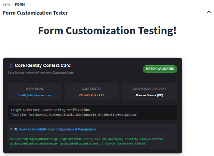
2. The Comprehensive Identity Profile Dashboard Block
This configuration completely redesigns the standard field display, arranging identity metadata into a clean, floating management console card. It builds a profile header, stacks metadata items horizontally via custom widths inside a flex row layout, and embeds a togglable <details> log summary directly inside the widget base:
<div style='background: #1e1e24; color: #fff; border: 1px solid #2d2d35; border-radius: 8px; box-shadow: 0 6px 16px rgba(0,0,0,0.15); max-width: 650px; font-family: sans-serif; padding: 16px;'>
  <div style='display: flex; justify-content: space-between; align-items: center; border-bottom: 1px solid #2d2d35; padding-bottom: 12px; margin-bottom: 14px;'>
    <div>
      <span style='font-size: 16px; font-weight: bold; color: #fff; text-shadow: 1px 1px 2px rgba(0,0,0,0.3);'>👤 Core Identity Context Card</span><br>
      <span style='font-size: 11px; color: #8a8a93;'>Data Source: Active HR Authority Sync</span>
    </div>
    <div style='background: #2e7d32; color: #fff; border: 1px solid #4caf50; padding: 4px 10px; border-radius: 12px; font-size: 11px; font-weight: bold; text-transform: uppercase;'>Match Validated</div>
  </div>
  <div style='display: flex; gap: 10px; margin-bottom: 14px;'>
    <div style='width: 33%; background: #25252d; padding: 8px; border-radius: 4px; text-align: center;'>
      <span style='font-size: 10px; color: #8a8a93; text-transform: uppercase;'>Work Email</span><br>
      <span style='font-size: 11px; font-weight: bold; color: #3498db; word-break: break-all;'>t.rett@identityexe.com</span>
    </div>
    <div style='width: 33%; background: #25252d; padding: 8px; border-radius: 4px; text-align: center;'>
      <span style='font-size: 10px; color: #8a8a93; text-transform: uppercase;'>Cost Center</span><br>
      <code style='font-size: 11px; color: #e67e22; font-weight: bold;'>CC-AZ-PHX-991</code>
    </div>
    <div style='width: 34%; background: #25252d; padding: 8px; border-radius: 4px; text-align: center;'>
      <span style='font-size: 10px; color: #8a8a93; text-transform: uppercase;'>Management Anchor</span><br>
      <span style='font-size: 11px; font-weight: bold; color: #fff;'>Marcus Vance (VP)</span>
    </div>
  </div>
  <div style='white-space: pre-wrap; font-family: monospace; font-size: 12px; background: #151518; padding: 10px; border-radius: 4px; border: 1px solid #25252d; color: #aaa; margin-bottom: 14px;'>
    Target Directory BaseDN String Verification:
`CN=Tyler Rettkowski,OU=Consultants,OU=Glendale,DC=identityexe,DC=com`
  </div>
  <details style='cursor: pointer; background: #25252d; padding: 8px; border-radius: 4px; border: 1px solid #2d2d35;'>
    <summary style='font-weight: bold; font-size: 12px; color: #3498db;'>🔍 View Active Multi-Tenant Operational Parameters</summary>
    <div style='margin-top: 10px; font-family: monospace; font-size: 11px; color: #2ecc71; border-top: 1px solid #2d2d35; padding-top: 8px;'>
      sailpointWorkgroupMembership: [Mgt-Override-Tier3, Sec-Ops-Approver]<br>
      identityLifecycleState: authorizedContractorExtension<br>
      associatedAccountsCount: 7 Source Connectors Linked
    </div>
  </details>
</div>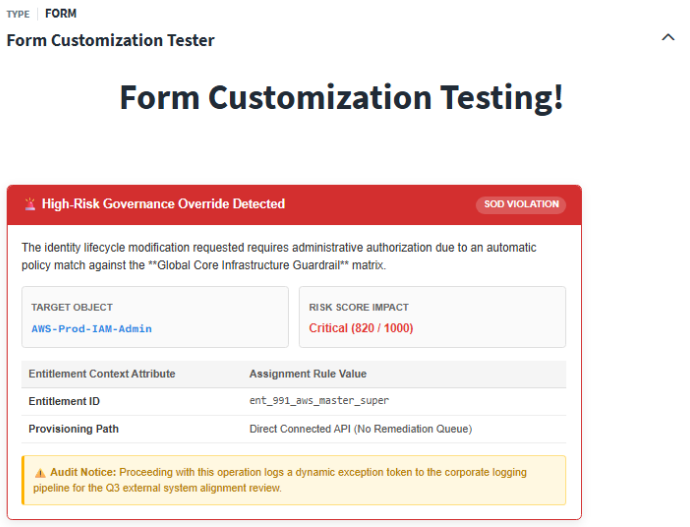
3. The Interactive Access Verification Checksheet
This component models an inline compliance overview dashboard sheet. It leverages detailed status rows with border separation accents, floating status badges, and an accent informational callout box. This configuration shows off how text alignment, borders, and flex structures can generate enterprise-grade UI designs natively inside SailPoint descriptions:
<div style='background: #fff; border: 1px solid #cfd8dc; border-radius: 8px; box-shadow: 0 4px 10px rgba(0,0,0,0.05); max-width: 650px; font-family: sans-serif; padding: 16px;'>
  <div style='font-size: 15px; font-weight: bold; color: #37474f; margin-bottom: 4px;'>📋 Pre-Provisioning Compliance Verification Checksheet</div>
  <p style='margin: 0 0 16px 0; font-size: 12px; color: #78909c;'>Verify downstream target platform state criteria prior to authorizing transaction execution.</p>
  <div style='padding: 10px 0; border-bottom: 1px dashed #cfd8dc; display: flex; justify-content: space-between; align-items: center; font-size: 13px;'>
    <span style='color: #455a64; font-weight: bold;'>1. Downstream Target Core System Connectivity State</span>
    <span style='background: #e8f5e9; color: #2e7d32; padding: 2px 8px; border-radius: 4px; font-size: 11px; font-weight: bold; text-transform: uppercase;'>Online / Available</span>
  </div>
  <div style='padding: 10px 0; border-bottom: 1px dashed #cfd8dc; display: flex; justify-content: space-between; align-items: center; font-size: 13px;'>
    <span style='color: #455a64; font-weight: bold;'>2. Identity Correlated Account Link Check</span>
    <span style='background: #fff3e0; color: #e65100; padding: 2px 8px; border-radius: 4px; font-size: 11px; font-weight: bold; text-transform: uppercase;'>Link Unmatched (Will Create)</span>
  </div>
  <div style='padding: 10px 0; border-bottom: 1px dashed #cfd8dc; display: flex; justify-content: space-between; align-items: center; font-size: 13px;'>
    <span style='color: #455a64; font-weight: bold;'>3. Licensing Availability Pool Threshold Validation</span>
    <span style='background: #e8f5e9; color: #2e7d32; padding: 2px 8px; border-radius: 4px; font-size: 11px; font-weight: bold; text-transform: uppercase;'>Seats Allocated OK</span>
  </div>
  <div style='margin-top: 14px; background: #eceff1; padding: 10px; border-radius: 4px; border-left: 4px solid #607d8b; font-size: 12px; color: #37474f; line-height: 1.45;'>
    <strong>💡 Implementation Note:</strong> Downstream account correlation calculations will use the primary identity anchor matching formula on the next scheduled engine aggregation run cycle.
  </div>
</div>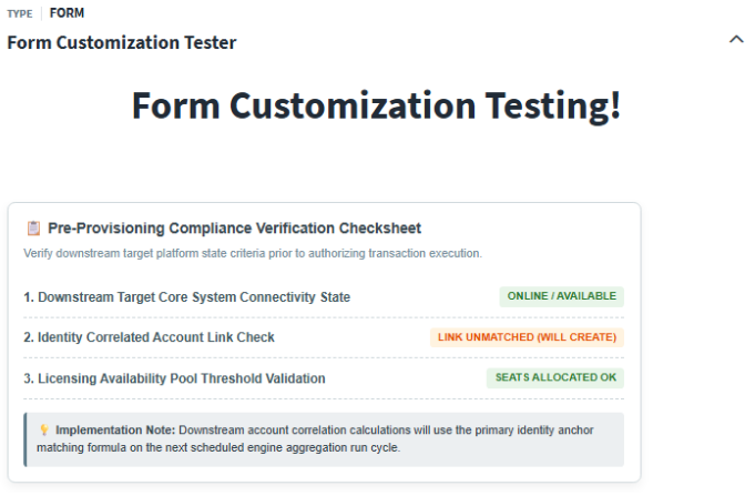
Form Title Customization (Unicode, Emojis & Pseudo-Fonts)
While the form body is highly customizable via HTML and CSS, the form title is handled differently. The title is processed as a strict plain-text text node.
If you attempt to inject tags like <span> or <strong> into a form title, they will either render literally (<span>Title</span>) or be completely stripped by the cross-site scripting (XSS) sanitizer.
However, you can still customize form titles by bypassing the HTML renderer entirely and leveraging Unicode glyphs, emojis, and mathematical alphanumeric pseudo-fonts.
Here are five highly effective production layout patterns that successfully customize the header:
- The Multi-Segment Governance Breadcrumb:
Uses light geometric arrows and vertical pipe characters to separate context cleanly:🌐 GOVERNANCE ┃ Account Provisioning Engine ➔ AD_Target_Console - The High-Contrast Security Callout Banner:
Utilizes double-line box margins and distinct status indicators to establish a hard visual boundary:║ ⛔ SECURITY EXCEPTION ║ 𝖫𝖨𝖥𝖤𝖢𝖸𝖢𝖫𝖤_𝖲𝖳𝖳𝖤_𝖬𝖮𝖣𝖨𝖥𝖨𝖢𝖠𝖳𝖨𝖮𝖭 - The Minimalist Technical Audit Header:
Combines thick vertical block accents with a faux-monospace font block:▍ [AUDIT LOG SUMMARY] Identity Lifecycle Parameters : 𝖢𝖮𝖱𝖢_𝖧𝖱_𝖠𝖴𝖳𝖧𝖮𝖱𝖨𝖳𝖸 - The Tokenized Action & Target Panel Header:
Structures text explicitly using mathematical bold characters and index dividers to mimic an app title bar:📋 𝐃𝐚𝐬𝐡𝐛𝐨𝐚𝐫𝐝 𝐕𝐞𝐫𝐢𝐟𝐢𝐜𝐚𝐭𝐢𝐨𝐧 𝐂𝐨𝐧𝐬𝐨𝐥𝐞 ▪ Target Object Reference Matrix ▪ [Active] - The Alert-Level Status Matrix Block:
Leverages heavy color warning blocks and explicit visual boundaries:⚠️ 🟥 [CRITICAL OVERRIDE ALERT] 🟥 𝖦𝖫𝖮𝖡𝖠𝖫_𝖨𝖭𝖥𝖱𝖠_𝖦𝖴𝖠𝖱𝖣𝖱𝖠𝖨𝖫
Technical Title Limitations
- The "Broken Square" Fallback: Alphanumeric blocks (the math characters used to fake bold or sans-serif styling) rely on the client browser's Unicode rendering. On older operating systems or thin clients, these characters may render as empty boxes (
□). - Strict Truncation Boundaries: Form headers have a fixed width in the viewport. Long titles or heavy glyph sequences can easily get clipped, causing the UI to append an ellipsis (
...) and hide critical text. - No Layout Engine Support: Margins, padding, or flex alignment properties cannot be applied within titles. All layout must rely on native space characters.
Security, Contrast & Schema Guardrails
When pushing the limits of Form UI customization, you must stay within SailPoint's platform boundaries. Breaking these rules will result in either broken layouts or deployment errors.
1. Active Cross-Site Scripting (XSS) Sanitization
SailPoint aggressively sanitizes interactive elements:
- Direct Script Tags: Any
<script>tag will be stripped from the DOM. - Event Handlers: Inline attributes like
onclick,onmouseover, or other DOM event triggers are parsed and filtered out. - Malicious URLs: Links utilizing
javascript:alert('XSS')protocols are cleanly blocked.
2. Contrast Safety: Light vs. Dark Mode
SailPoint ISC defaults to a dark gray font color inside native description blocks.
🚨 Contrast Warning
If you create a custom widget with a dark background shade (like background-color: #222;) and do not explicitly define an interior text color (like color: #fff;), the text will merge with the background on light-theme systems, rendering it completely invisible. Always pair dark background-colors with explicit text colors.
3. JSON Configuration Schema Boundaries
When importing form definitions, the JSON parser expects strict compliance:
⚠️ Schema Warning
If your custom HTML block contains raw unescaped double quotes (") or unescaped line breaks, the Form JSON schema validation will fail and reject your import payload. You must use single quotes (') for HTML attributes inside your JSON, and ensure all multiline structures are kept flat or escaped using explicit newline tokens (\n).
4. Automatic Error Resiliency
If a developer accidentally leaves an HTML tag open (e.g., a missing </div>), the Form rendering engine will isolate the node and close it automatically. While this prevents the rest of the SailPoint page from breaking, it can distort your intended layout, so always validate your closing tags.
The Masterclass: Dynamic HTML Compilation via Serial Loops
Now that we understand the visual thresholds of the Form body, let's explore how to dynamically inject customized HTML widgets into your forms using SailPoint Workflows.
Instead of writing static text, you can initialize a workflow string variable, run a serial loop to iterate over a collection of objects, and concatenate stylized HTML fragments. This compiled variable is then passed directly into a form's input block.
Initialization
Launched via administrative process or schedule.
Initialize empty string variable inputloopbuilder.
Serial Loop Execution
Query identities list from SailPoint REST endpoint.
Concatenate and append custom-styled HTML table for each user to builder string.
Rendering Dashboard
Pass compiled HTML string as a variable input.
Render beautifully-styled, high-density HTML dashboard inside user form.
Setup Walkthrough: The Form Customization Tester Workflow
Let's build a real-world example. We'll construct a workflow that grabs a list of identities from the SailPoint tenant, loops through them to build an identity context block featuring a profile summary, an identity state badge, and an accordion detail wrapper, and presents it in a custom form layout.
Here is how the workflow is defined:
Step 1: Initialize the Loop Variable
Add a Define Variable step at the start of your workflow. Create a string variable called inputloopbuilder and leave it empty (or initialize it with an outer wrapping CSS layout tag).
"Define Variable": {
  "actionId": "sp:define-variable",
  "attributes": {
    "id": "sp:define-variable",
    "variables": [
      {
        "description": "",
        "name": "inputloopbuilder",
        "transforms": []
      }
    ]
  },
  "nextStep": "HTTP Request",
  "type": "Mutation"
}
Step 2: Fetch the Core Identities
Use an HTTP Request step to query your target identities list from the API:
- Endpoint:
GET /v2026/identities
"HTTP Request": {
  "actionId": "sp:http",
  "attributes": {
    "method": "get",
    "param_authenticationRef": "oauth",
    "requestContentType": "json",
    "url": "https://{{your-tenant}}.api.identitynow.com/v2026/identities"
  },
  "nextStep": "Serial Loop",
  "type": "action",
  "versionNumber": 3
}
Step 3: Run the Serial Loop Iteration
Add a Serial Loop step to iterate over the HTTP response body:
- Input Array:
$.hTTPRequest.body
"Serial Loop": {
  "actionId": "sp:serial:iterator",
  "attributes": {
    "input.$": "$.hTTPRequest.body",
    "loopType": "forLoop",
    "start": "Update Variable",
    "steps": {
      ...
    }
  },
  "nextStep": "Interactive Form",
  "type": "action",
  "versionNumber": 1
}
Step 4: Concatenate the Custom HTML block
Inside the serial loop, add an Update Variable step. Use the sp:transform:concatenate:string transform to append the stylized HTML table structure for the current identity to $.defineVariable.inputloopbuilder:
"Update Variable": {
  "actionId": "sp:update-variable",
  "attributes": {
    "id": "sp:update-variable",
    "variables": [
      {
        "name": "$.defineVariable.inputloopbuilder",
        "variableA.$": "$.defineVariable.inputloopbuilder",
        "transforms": [
          {
            "id": "sp:transform:concatenate:string",
            "input": {
              "variableB": "<table style='width: 100%; border-collapse: collapse; background: #fff; border: 1px solid #cfd8dc; border-left: 5px solid #3498db; border-radius: 8px; box-shadow: 0 4px 10px rgba(0,0,0,0.04); font-family: sans-serif; margin-bottom: 12px;'><tr><td style='padding: 12px; width: 35%;'><span style='font-weight: bold; font-size: 14px; color: #1e293b;'>👤 {{$.loop.loopInput.attributes.displayName}}</span><br><span style='font-size: 11px; color: #64748b; font-weight: 600; text-transform: uppercase;'>{{$.loop.loopInput.attributes.title}}</span><br><span style='font-size: 11px; color: #94a3b8;'>UID: <code style='font-family: monospace; color: #d63384;'>{{$.loop.loopInput.attributes.uid}}</code></span></td><td style='padding: 12px; width: 40%; font-size: 12px; color: #334155; vertical-align: top;'>📧 <span style='font-family: monospace; color: #e11d48;'>{{$.loop.loopInput.emailAddress}}</span><br>📍 Location: <strong style='color: #475569;'>{{$.loop.loopInput.attributes.location}}</strong><br>👔 Manager: <span style='font-size: 11px; opacity: 0.85; font-weight: bold;'>{{$.loop.loopInput.managerRef.name}}</span></td><td style='padding: 12px; width: 25%; text-align: right; vertical-align: top;'><span style='background: #e8f5e9; border: 1px solid #c8e6c9; color: #2e7d32; padding: 3px 8px; border-radius: 12px; font-size: 11px; font-weight: bold; text-transform: uppercase;'>{{$.loop.loopInput.attributes.identityState}}</span></td></tr><tr><td colspan='3' style='padding: 0 12px 12px 12px;'><details style='cursor: pointer; background: #f8fafc; padding: 8px; border-radius: 4px; border: 1px solid #e2e8f0;'><summary style='font-weight: bold; font-size: 11px; color: #475569;'>🔍 View Lifecycle & Sync Parameters</summary><div style='margin-top: 8px; font-family: monospace; font-size: 11px; color: #334155; border-top: 1px dashed #cbd5e1; padding-top: 6px; white-space: pre-wrap; word-break: break-all;'>Internal ID: {{$.loop.loopInput.id}}\nCreated: {{$.loop.loopInput.created}}\nModified: {{$.loop.loopInput.modified}}\nLast Sync Signature: {{$.loop.loopInput.attributes.lastSyncDate}}</div></details></td></tr></table>"
            }
          }
        ]
      }
    ]
  },
  "nextStep": "End Step - Success 1",
  "type": "Mutation"
}
Step 5: Render the Compiled HTML Output in the Form
After the loop completes, send the accumulated variable directly into an Interactive Form step:
"Interactive Form": {
  "actionId": "sp:interactive-form",
  "attributes": {
    "formDefinitionId": "c27dbd2a-dd5c-45c7-bfbe-0c3d518c3f6e",
    "inputForForm_input.$": "$.defineVariable.inputloopbuilder",
    "title": "Form Customization Tester"
  },
  "nextStep": "End Step - Success",
  "type": "action",
  "versionNumber": 1
}
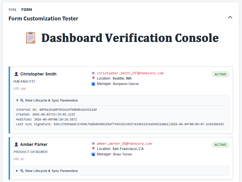
The Rendered Result
When the interactive process is launched, the engine loops through your active identities, constructs the table elements, and displays a beautifully structured directory block natively inside the user form:
Conclusion & Call to Action
Form design is often treated as an afterthought in Identity Governance, but it has a massive impact on adoption, accuracy, and operational overhead. By leveraging basic HTML, advanced Flexbox alignments, interactive <details> dropdowns, and dynamic serial loop variables, you can elevate your SailPoint Form UI from a simple input collector to a powerful dashboard experience.
If you are looking to deploy this solution or want to implement custom form UI dashboards in your environment, schedule a call with me by using the Talk to an Expert button below.
Configuration Snippets & Downloads
Form Customization Tester (Workflow)
Workflow retrieving identities, dynamically building custom HTML elements inside a serial loop, and rendering a directory view inside an interactive form.
Need a custom reporting or governance dashboard?
Whether you are developing complex multi-source aggregations, automating task gateways, or deploying customized alert dashboards, custom expert support helps you deploy safely.